🏆 Won the Lone Skipper Shippie Award from Revenue Cat, and was featured in billboards across San Francisco, September 2024
Shotsy is an app that helps users track GLP-1 medications (such as Ozempic, Wegovy, etc) by providing insight into the level of medication still in one's body, convenient side effect/result logging, and a comprehensive history of past shots. Shotsy had a great foundation functionality-wise, and the benefit of being the first app of it's kind on the market, but the developer knew that the visuals were lacking and that users would soon demand a more polished, thoughtful experience as competitors joined the scene.
I joined the solo developer of Shotsy as a freelance UX designer.
Static
Scroll
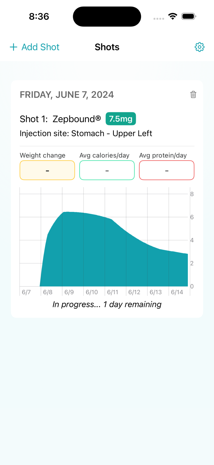
Existing UX was unintuitive in places, while UI was dated and clunky
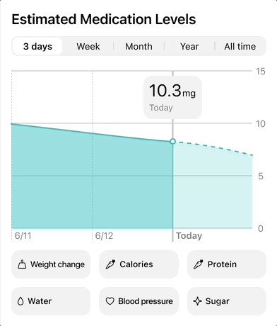
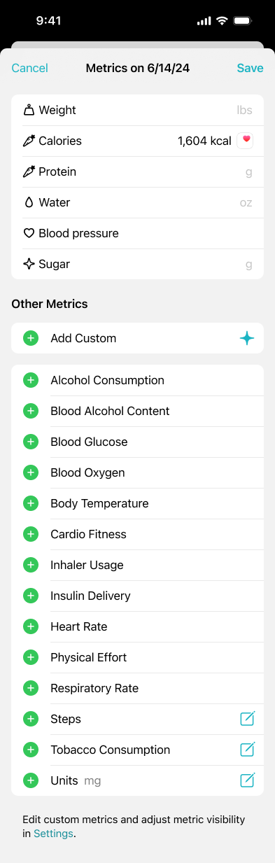
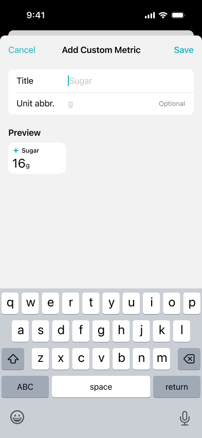
Users had requested additional metrics to track, but it was a difficult undertaking to try and add every possible health metric to the app natively
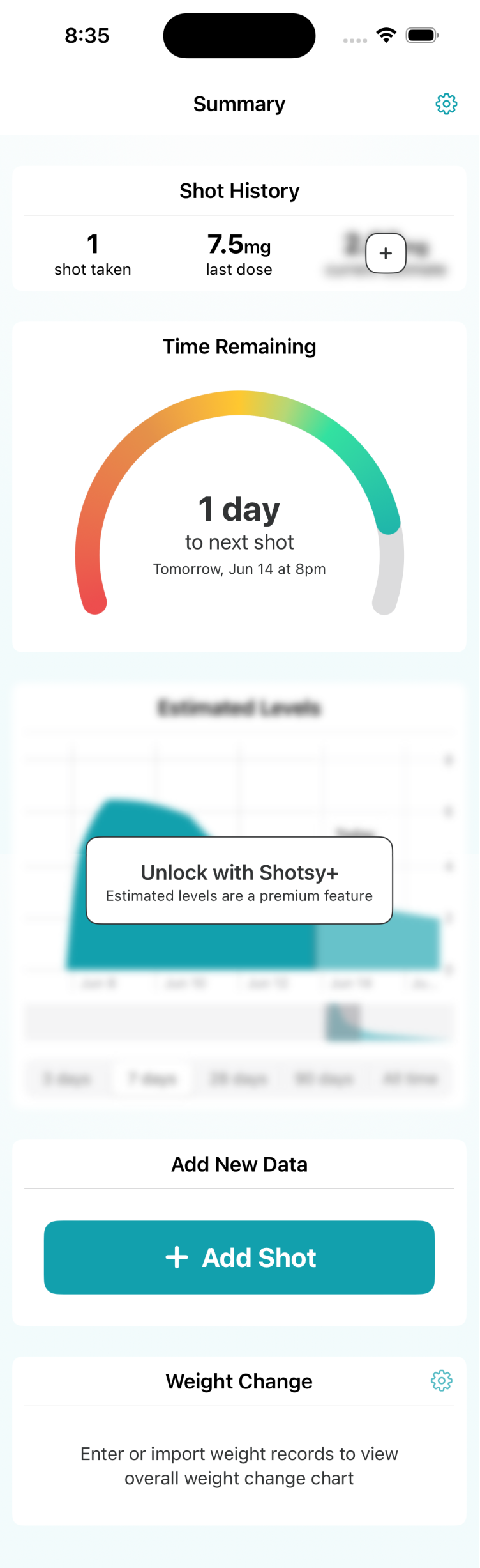
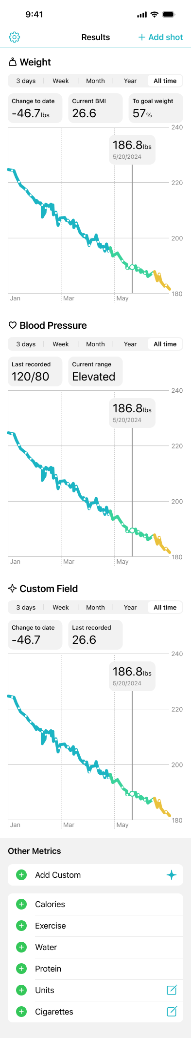
Weight change graph was confined to the Summary page, missing an opportunity to compare other metrics to overall weight loss
Outside of the app, the web landing page was basically a copy of the App Store page, another missed opportunity
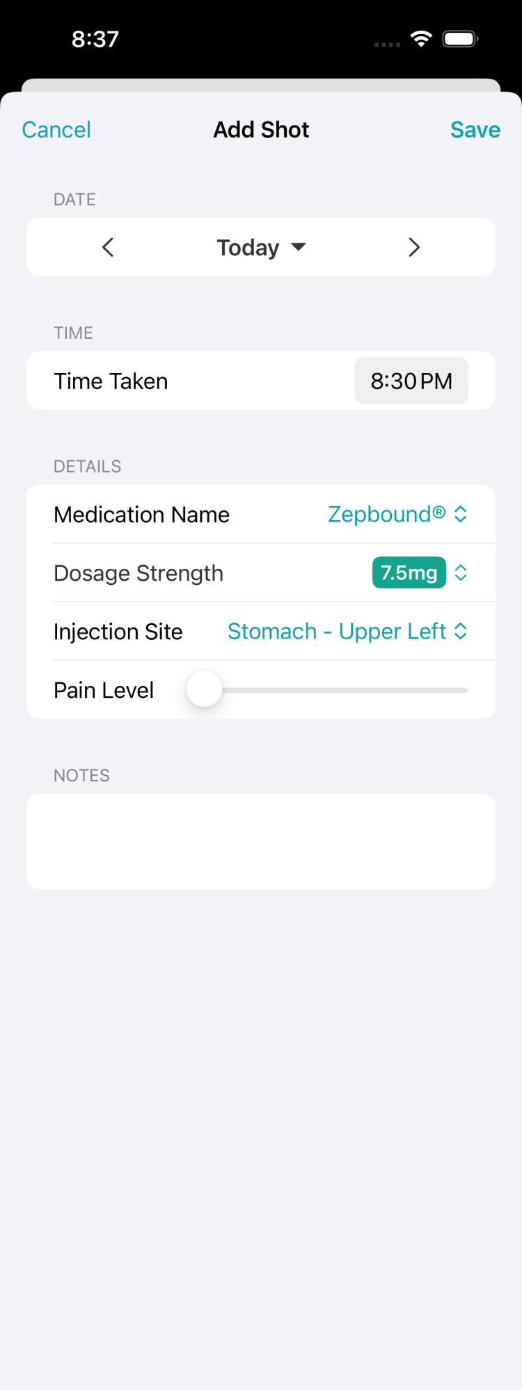
Find a way to allow users to customize the way they track their medication without overloading the app with a million metric options
Introduce milestone celebrations to encourage organic user sharing
General refinement of the brand and visuals
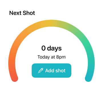
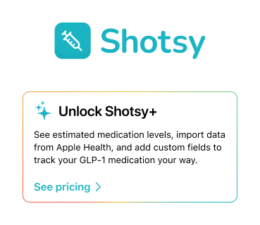
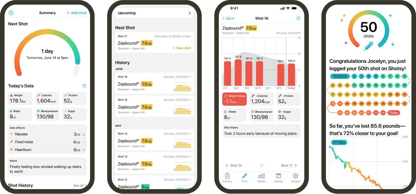
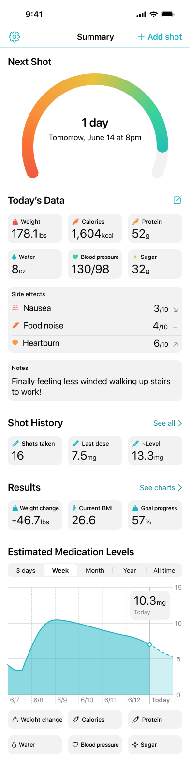
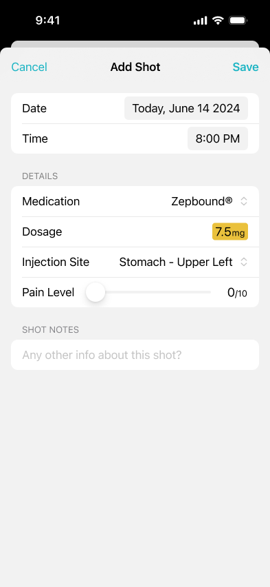
A mix of Apple Human Interface Guidelines and a custom design system come together to refresh and streamline the app's UI, and allowing users to create their own metrics and side effects ramps up customizability.
Static
Scroll
Static
Scroll
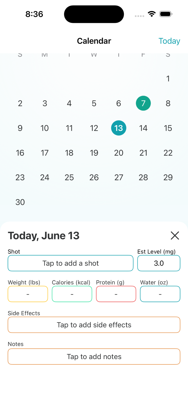
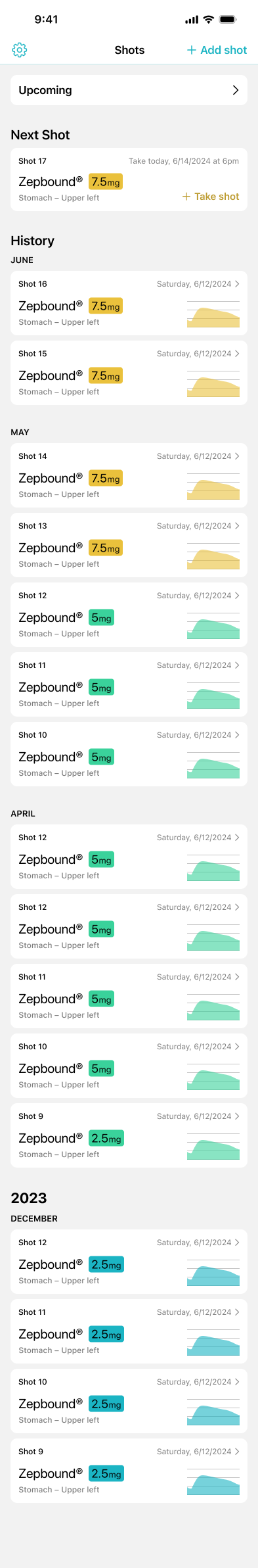
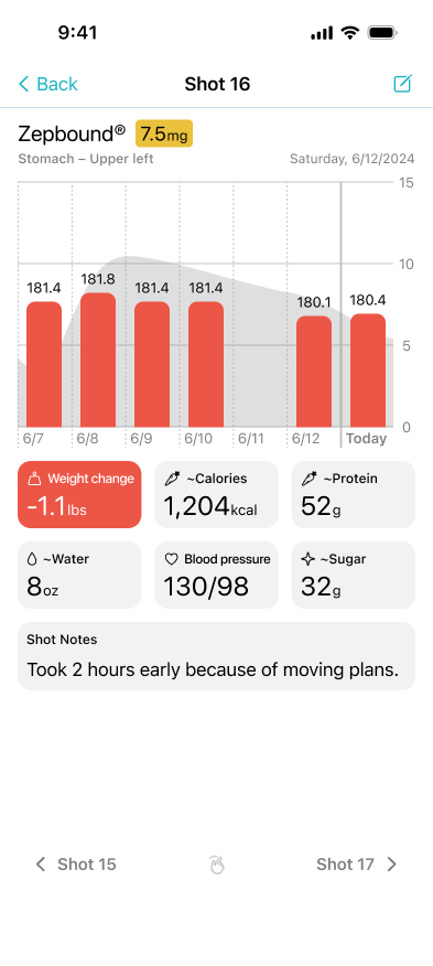
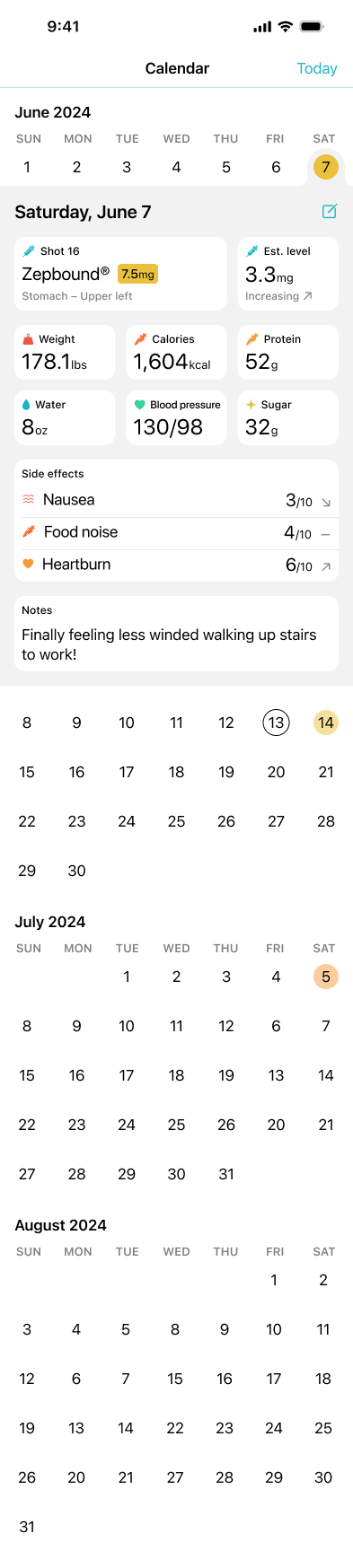
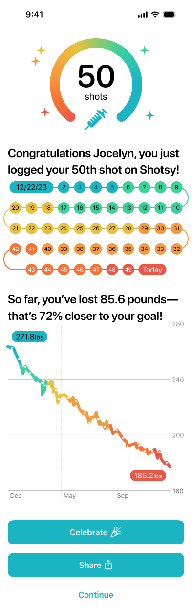
A more condensed view allows users to scan their shot history easier, or drill down to see the how each shot affected them individually. A new Results page shows all-time overviews of Weight Change or any other metric, and a revamped Calendar is easier to navigate for historical data.
Static
Scroll
Static
Scroll
Static
Scroll
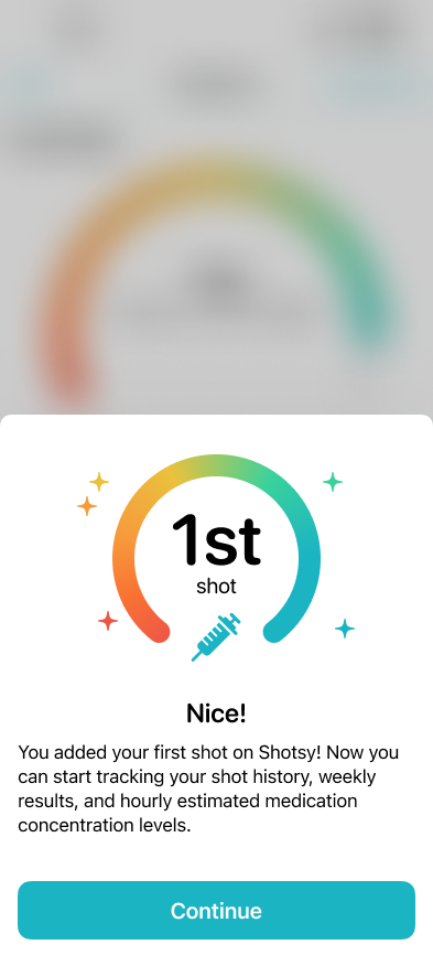
Existing users were already taking screenshots of Shotsy in order to share their excitement on social media, so we created a celebratory screen for certain milestones where users can spam the confetti button, or share a pre-populated image about their achievement.
Static
Scroll
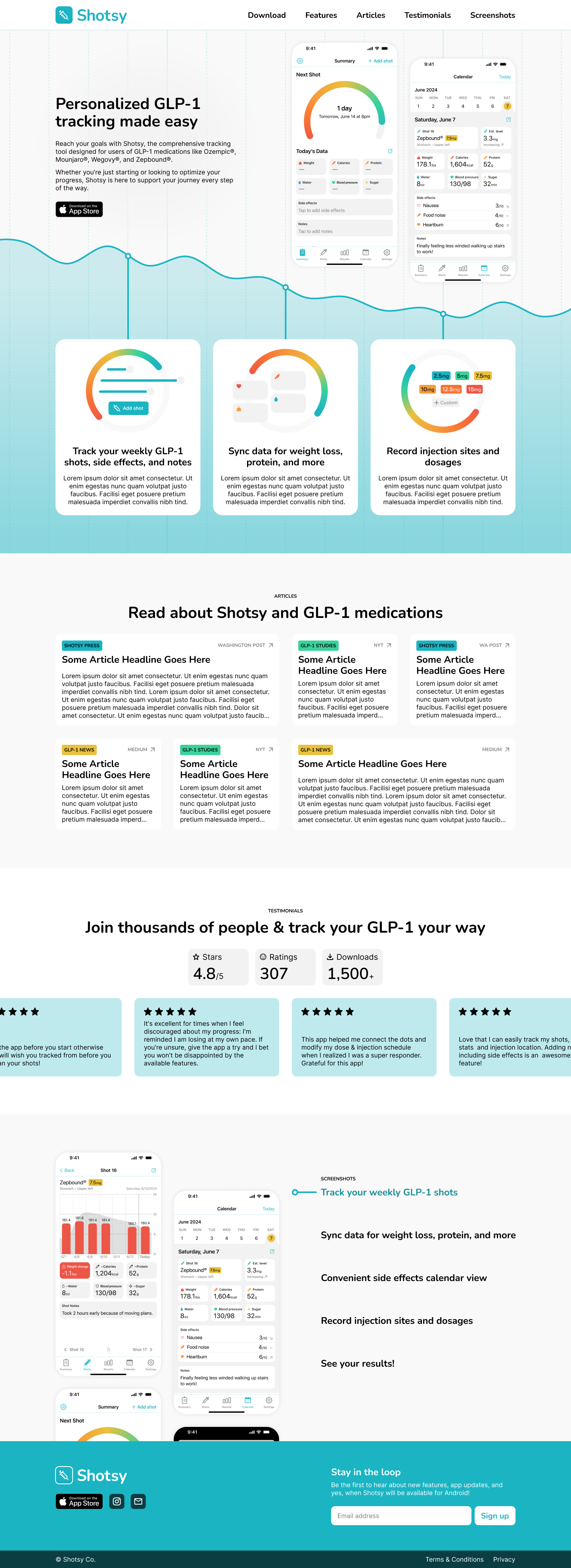
Though users typically have their first touchpoint with Shotsy on the App Store, I felt it was important that the web landing page be just as refined to match the new design of the app, especially with upcoming press inquiries and social outreach.
Static
Scroll

Static
Scroll
Shotsy's redesign improved consistency through a new design system while maintaining familiarity for early adopters. I introduced a custom metrics workflow for tracking personalized data, and milestone celebrations to boost engagement and social sharing. Definining Apple and non-Apple design tokens will enable the app’s expansion to Android, maintaining consistency across platforms. These changes, along with visual refinements, contributed to the app winning the Lone Skipper Shippie award and are forecasted to increase user retention, expand the user base, and drive organic growth through enhanced social sharing and user satisfaction.